SECTION 1: Who Uses Seattle’s Sidewalks (Human Context)
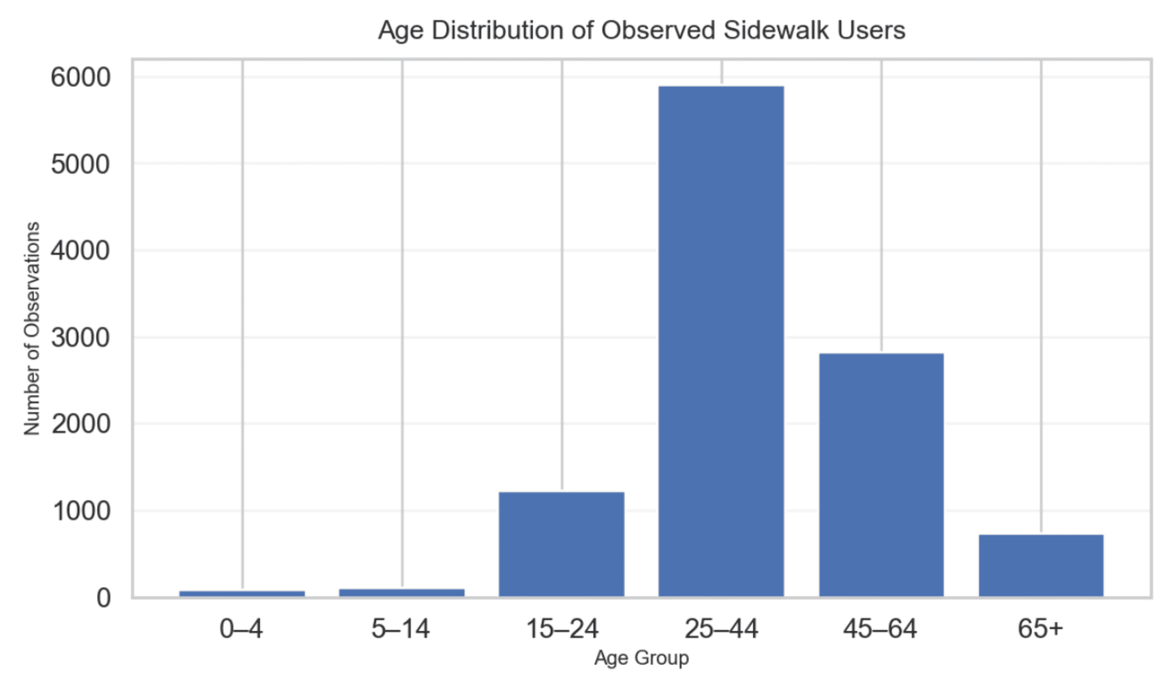
1. Age distribution of Observed Sidewalk Users
3. Severity by Barrier Type (Top 10)
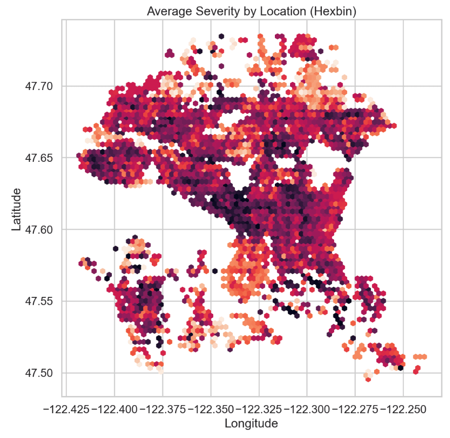
4. Barrier Density
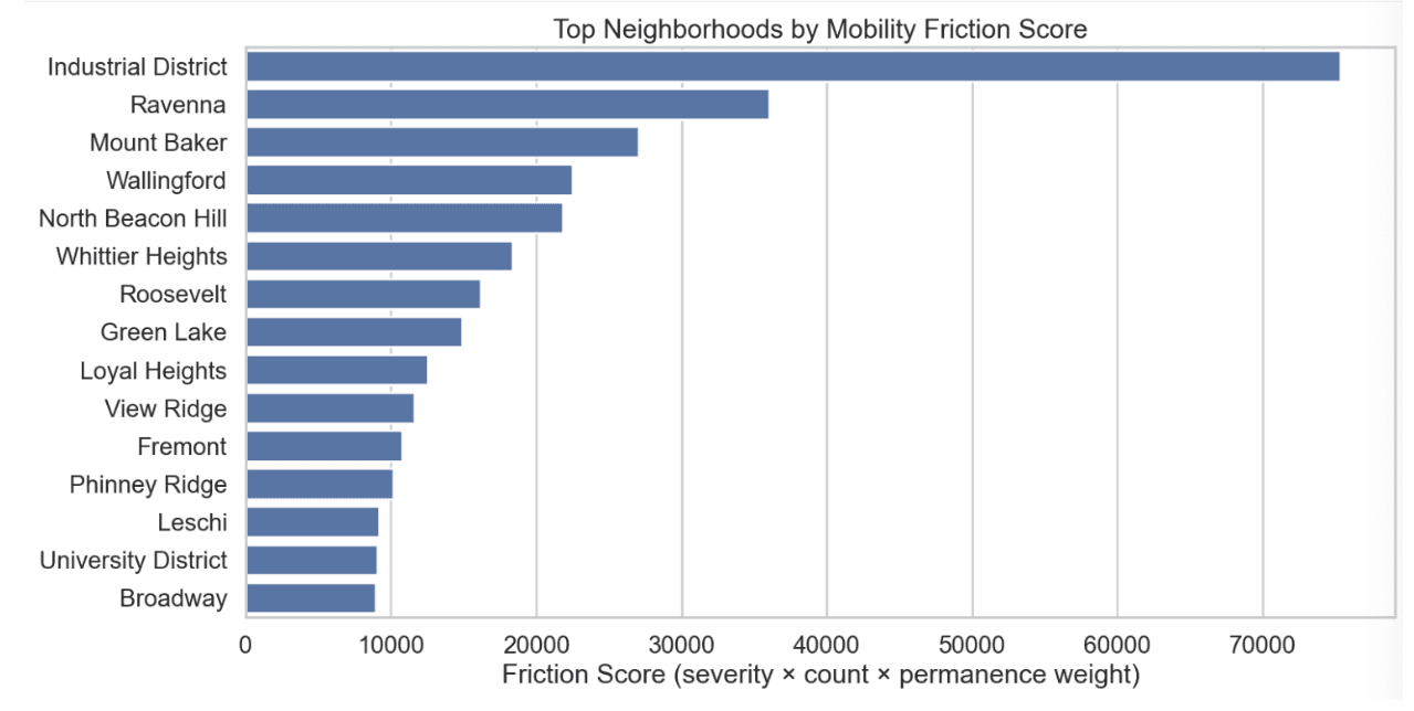
2. Top Neighborhoods by Mobility Friction Score
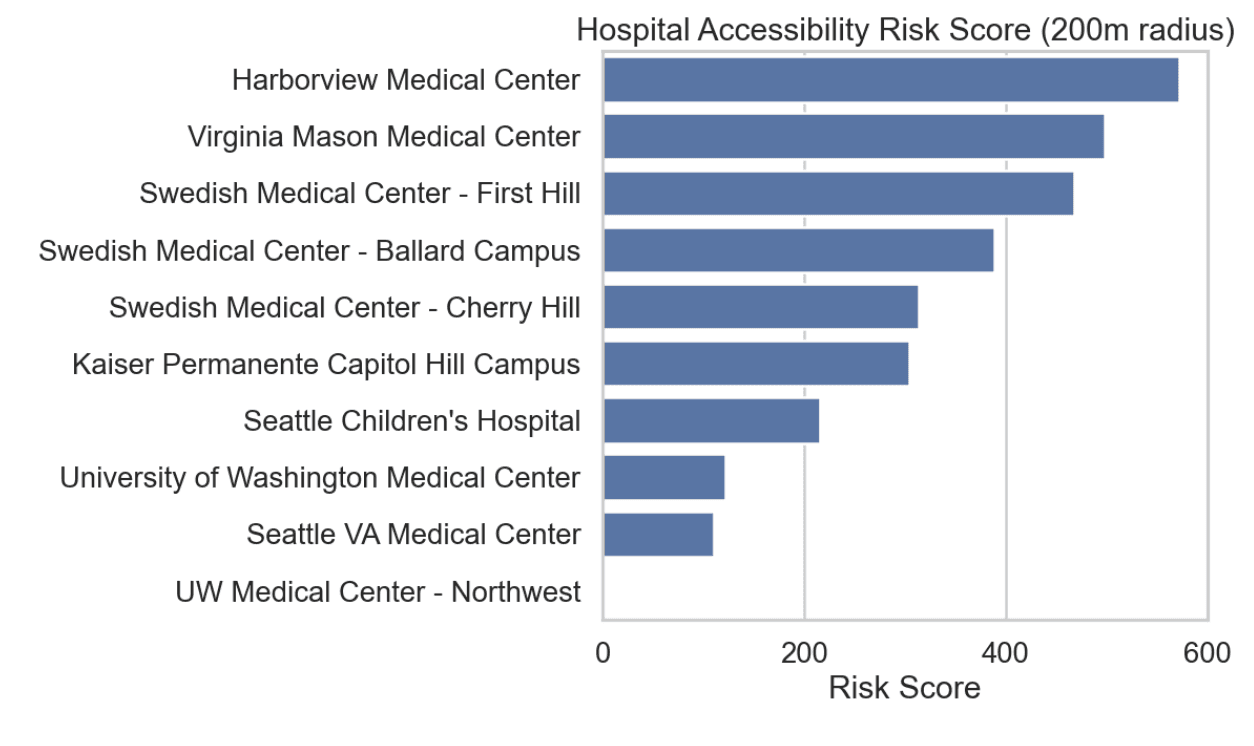
2. Hospital Accessibility Risk Score (200m Radius)
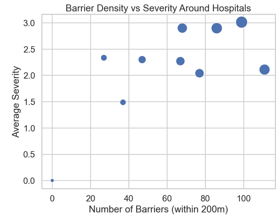
3. Barrier Density vs Severity Around Hospitals
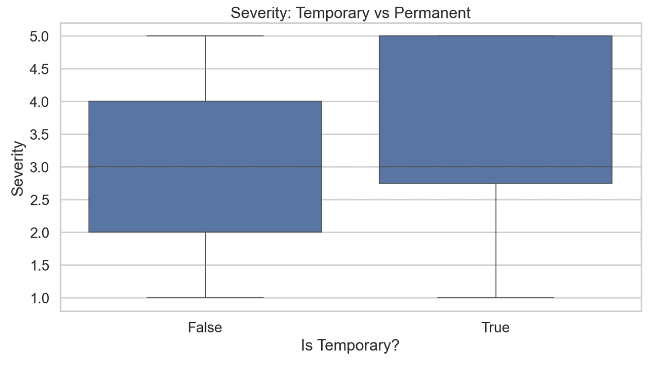
2. Severity: Temporary vs Permanent
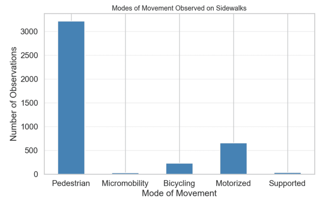
2. Modes of Movement Observed on Sidewalks
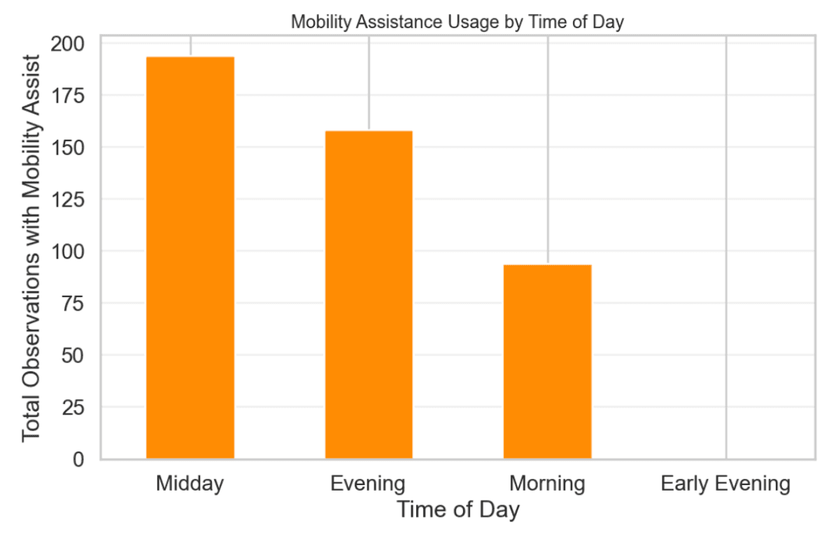
3. Mobility Assistance Usage by Time of Day
SECTION 2: What the barriers are (Nature + Severity)
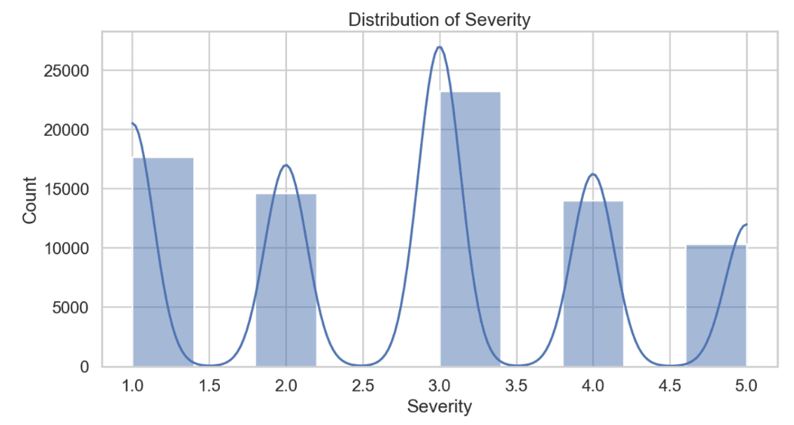
1. Distribution of Severity
SECTION 3: Where the problems are (Spatial Inequality)
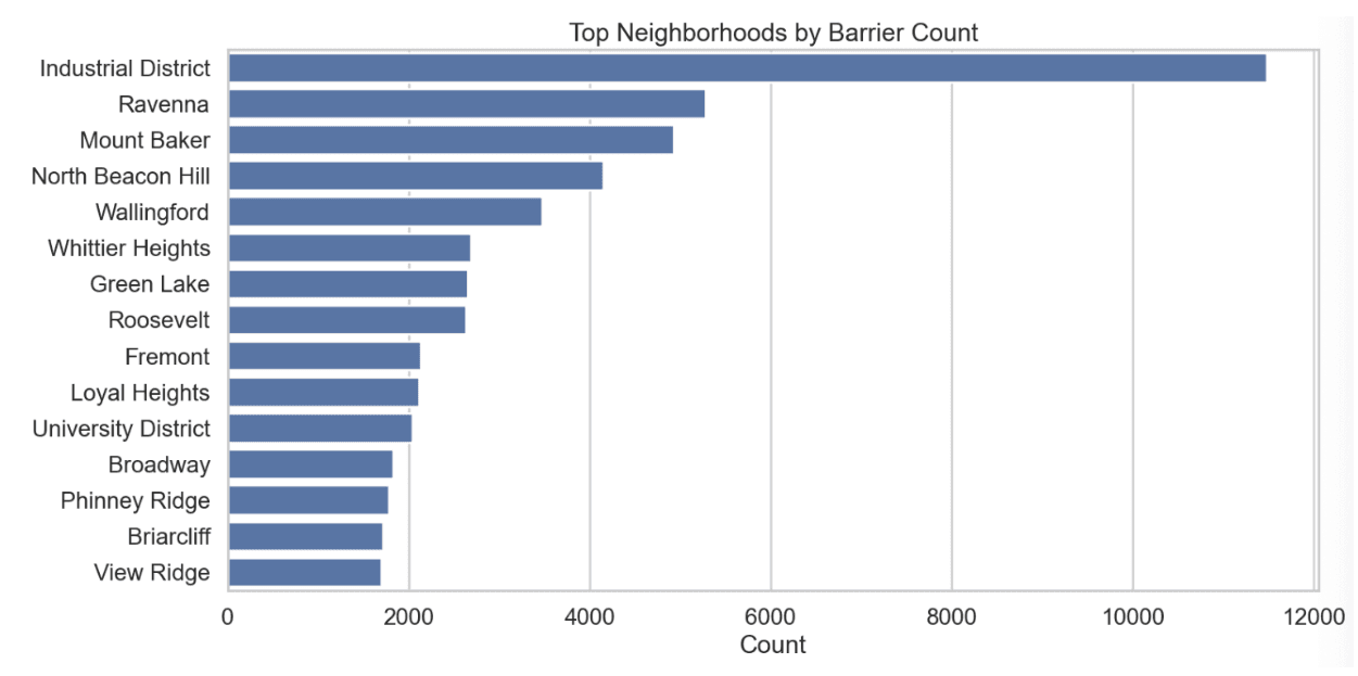
1. Top Neighborhoods by Barrier Count
SECTION 4: Composition and Consequences
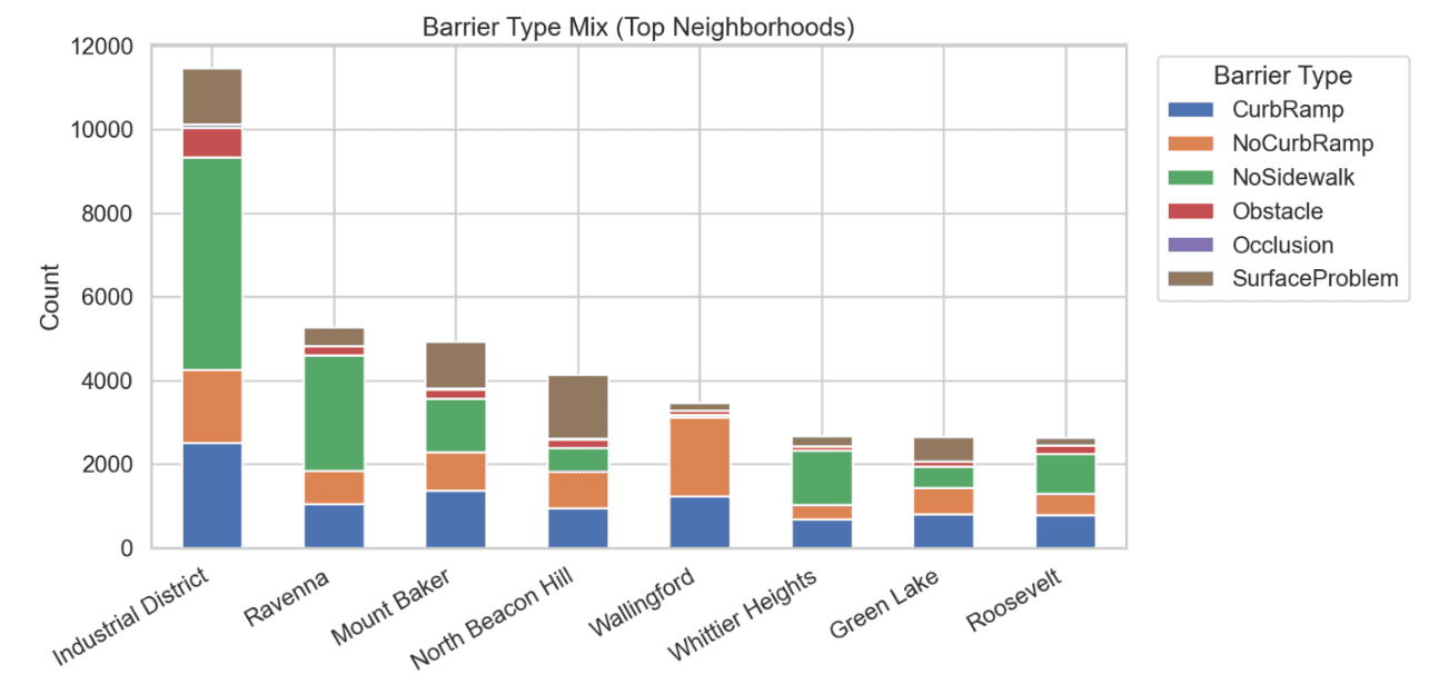
1. Barrier Type Mix by Top Neighborhoods
This chart demonstrates how the primary demographic of sidewalk users are working-age adults aged 25-44 and 45-64. There is also a significant number of seniors aged 65+. As older adults, who are more vulnerable to uneven infrastructure, are more likely to rely on mobility assistance, accessibility barriers disproportionately affect these populations that are already at a higher risk, making it imperative to increase sidewalk accessibility for public health and equity.
Most sidewalk users are either pedestrians or motorized, and a notable number also rely on supported mobility, micromobility, and bicycling. These modes are especially sensitive to surface conditions, curb ramps, and obstructions, meaning barriers can completely block access rather than simply slow moment–highlight why it’s so important to address sidewalk barriers.
Permanent barriers tend to have equal or higher severity than temporary ones, reinforcing their long-term impact on accessibility. Unlike temporary obstacles, these barriers persist daily, compounding their effect on users who rely on accessible infrastructure.
Certain barrier types, especially missing sidewalks and obstructions, show consistently higher severity scores. This indicates that the most common barriers are also amongst the most disruptive. This combination of frequency and severity makes these barrier types especially harmful to accessibility.
Barrier counts are unevenly distributed across neighborhoods, with areas like the Industrial District and Ravenna experiencing disproportionately high numbers. This suggests that accessibility challenges aren’t evenly shared across the city, raising concerns about geographic inequity in infrastructure quality.
Different neighborhoods exhibit distinct mixes of barrier types, suggesting localized infrastructure challenges. For instance, some areas struggle primarily with missing sidewalks, while others face curb ramp or surface issues. This implies that accessibility solutions must be tailored rather than one-solution-fits-all.
Several major hospitals are surrounded by high accessibility risk scores, indicating that reaching essential healthcare services may be difficult for people with mobility challenges. This is particularly concerning because hospitals serve populations who are more likely to rely on accessible infrastructure. The results show how sidewalk barriers translate directly into real-world access inequities.
Hospitals with higher surrounding barrier counts also tend to exhibit higher average severity, compounding accessibility risks. This relationship suggests that accessibility challenges near hospitals are not isolated or trivial. This ultimately reinforces the argument that infrastructure barriers have tangible impacts on healthcare access.
When severity and permanence are factored in, neighborhood rankings shift, revealing areas with barriers are not only numerous, but especially harmful. This metric better reflects real-world accessibility challenges rather than raw counts alone, highlighting neighborhoods where intervention would yield the greatest impact.
This spatial density map reveals clusters of barriers across the city rather than uniform distribution, with hotspots indicating concentrated zones of accessibility failure severity by location. The pattern suggests systemic planning issues rather than random occurrences in sidewalk accessibility.
Mobility assistance usage peaks during midday and evening hours, aligning with times when people are accessing services and jobs. This suggests that accessibility barriers disproportionately affect people during active daily travel periods when sidewalk access is the most critical, leading to a higher frequency.
Severity ratings cluster around moderate to high values, with a substantial number of barriers rated 3-5. This indicates that many barriers pose meaningful difficulties rather than just being a minor inconvenience. The distribution suggests accessibility issues are persistent and impactful, not just rare edge cases.

This project uses data from the Project Sidewalk Seattle Accessibility Dataset, containing crowdsourced observations of sidewalk conditions across Seattle, including accessibility barriers such as surface problems, obstacles, missing curb ramps, and other design challenges. Each record includes geographic coordinates, neighborhood information, severity ratings, and whether a barrier is temporary or permanent.
The data is used to identify and visualize barriers affecting mobility across Seattle, which we have processed to highlight patterns and distributions in location, severity, temporarity, and barrier type.
The following analysis of graphs allow users to better understand where issues are concentrated and how impactful they are at neighborhood and citywide levels.